Pathways

A platform to manage benefits received from government.

With a focus on helping individuals understand the Cliff Effect, Pathways is an application that compiles and provides information about benefits to those receiving government assistance.

Aug–Dec 2018
Collaborative project with Mikayla McMellan and Tuscan Duckro

  • Research
  • Interaction Design
  • UX/UI
  • Data Visualization

DAAPcares 2019

Research Background

Initially, we began with primary and secondary research on childhood poverty in Cincinnati.

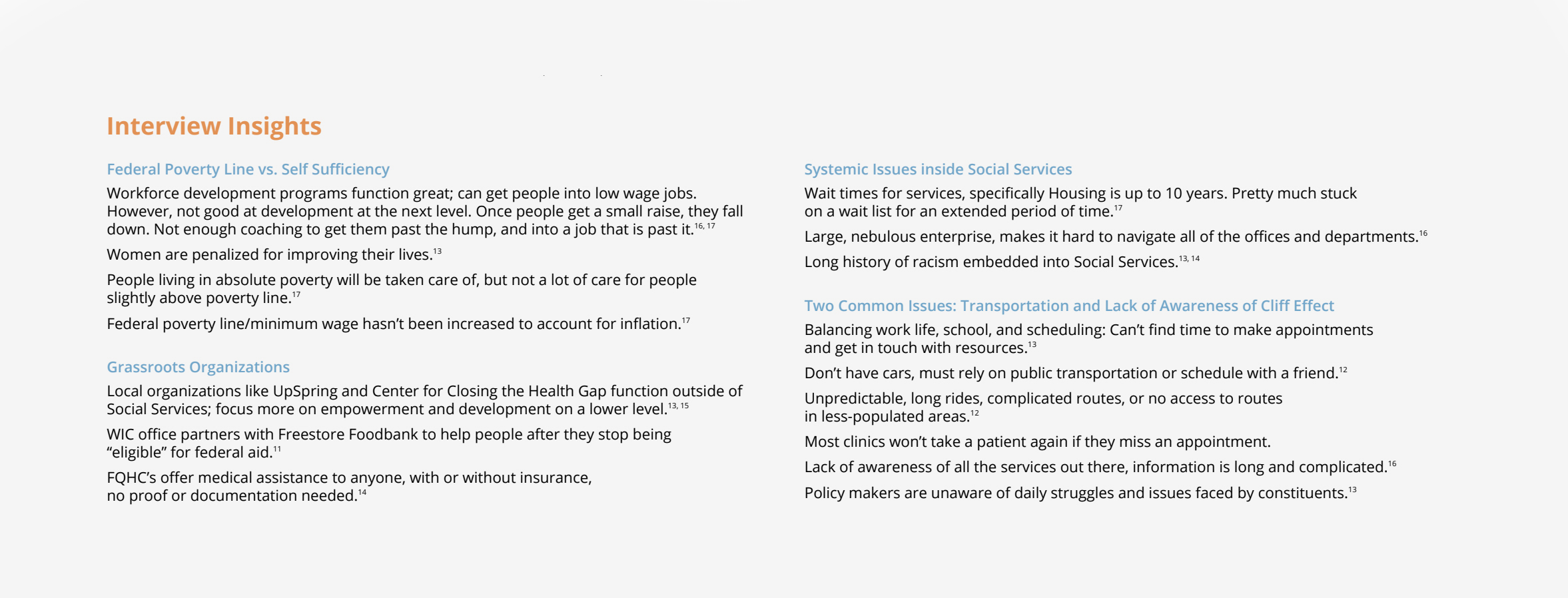
With secondary research, we were able to find common themes in family structure and how the typical household in poverty is one with a single mother. We then conducted primary research by interviewing social workers, volunteers, psychologists, medical practitioners, and government employees. Through these methods of research, we were able to gather our insights and find recurring themes and problem areas that individuals struggled with and found to be pain points in their day to day lives.

Refining Project Space

During one of our interviews, we heard about the Cliff Effect and decided to delve into it deeper.

The Cliff Effect occurs when someone who is working towards economic stability earns a wage increase, but this increase causes them a loss of benefits that are worth more than their raise. It’s taking one step forward, then two steps back.

From our previous research we had found that the average person who is in poverty in Cincinnati is a single mother, and more often than not tends to be African American. Online databases and past research done by organizations provided us with factual data to help connect all of our pieces of research and create an accurate journey map for our persona to visualize our findings on they would be affected by the Cliff Effect.

Design Opportunity

The problem is that people in poverty struggle to navigate Social Services and self-sufficiency.

To help alleviate some of the pain points for people struggling to navigate Social Services and self-sufficiency, we propose two solutions. First, there needs to be better education and transparency about benefit cutoffs and the Cliff Effect. Second, develop an application to help people keep track of their benefits, manage unsteady incomes, and plan for the future.

We began to benchmark on what was already out there to help people find and keep track of the benefits they were receiving. After that, it involved creating an information architecture, initial wireframes, visual style, and task flow to be continuously user-tested and revised. Throughout the design process, the constant evaluation was done to ensure comprehension. Whenever a new graph or visual element was created it was put in front of those who were not familiar with the topic of the Cliff Effect.

Project Delivereables

According to research, it is often difficult for families in poverty to plan for the future.

This app would make it easier to keep track of current benefits, find new benefits, as well as run what-if scenarios to see how changes in income and family situation might affect access to benefits.

In addition to the app, the website would be available for the user to get the initial onboarding of the app. This would help explain what each page of the app aims to do and how they can use it to their benefit.

-

Summary

Team:
Babaljit Kaur
Tuscan Duckro
Mikayla McMellan<


My Role & Responsibilities:
• Worked collaboratively with my team on primary and secondary research, interviewing and concept development • Lead the synthesis and visualization of the cliff journey map diagram • Wireframing, interface design, prototpying and user testing • Responsible for design/development of the onboarding web application that fits within the system

Recognition: This project was chosen as a finalist and featured in DAAPcares 2019

-

Reflection

User-Centered Design: Looking back, this was one of my first design research projects and allowed me to find my passion user centered design. The start and discovery phases of the project, and even leading into ideation, were fuzzy in terms of not always having a clear idea on what direction we were headed. Throughout the entire process, it was very important that we kept referencing and referring to the insights gained from the primary and secondary research to inform us and guide the design direction.

Simplifying Content: When the team started to dive into the theme of “Cliff Effect” it took awhile for us to wrap our head around it and fully begin to understand the process of it. There was a lot of complex information and ideas we wanted to convey to users, and it was important we simplified it in a way that could be easily understandable and digestible for the target audience.

User Testing: While working on this project, we had a limited timeframe for execution of it and because of this user tested with peers and those unfamiliar with the cliff effect. Getting user feedback was valuable to evolving our visual system and making sure it was easily understandable. If given more time, the team would have liked to user test with families and individuals who would be using this app to get more direct feedback.