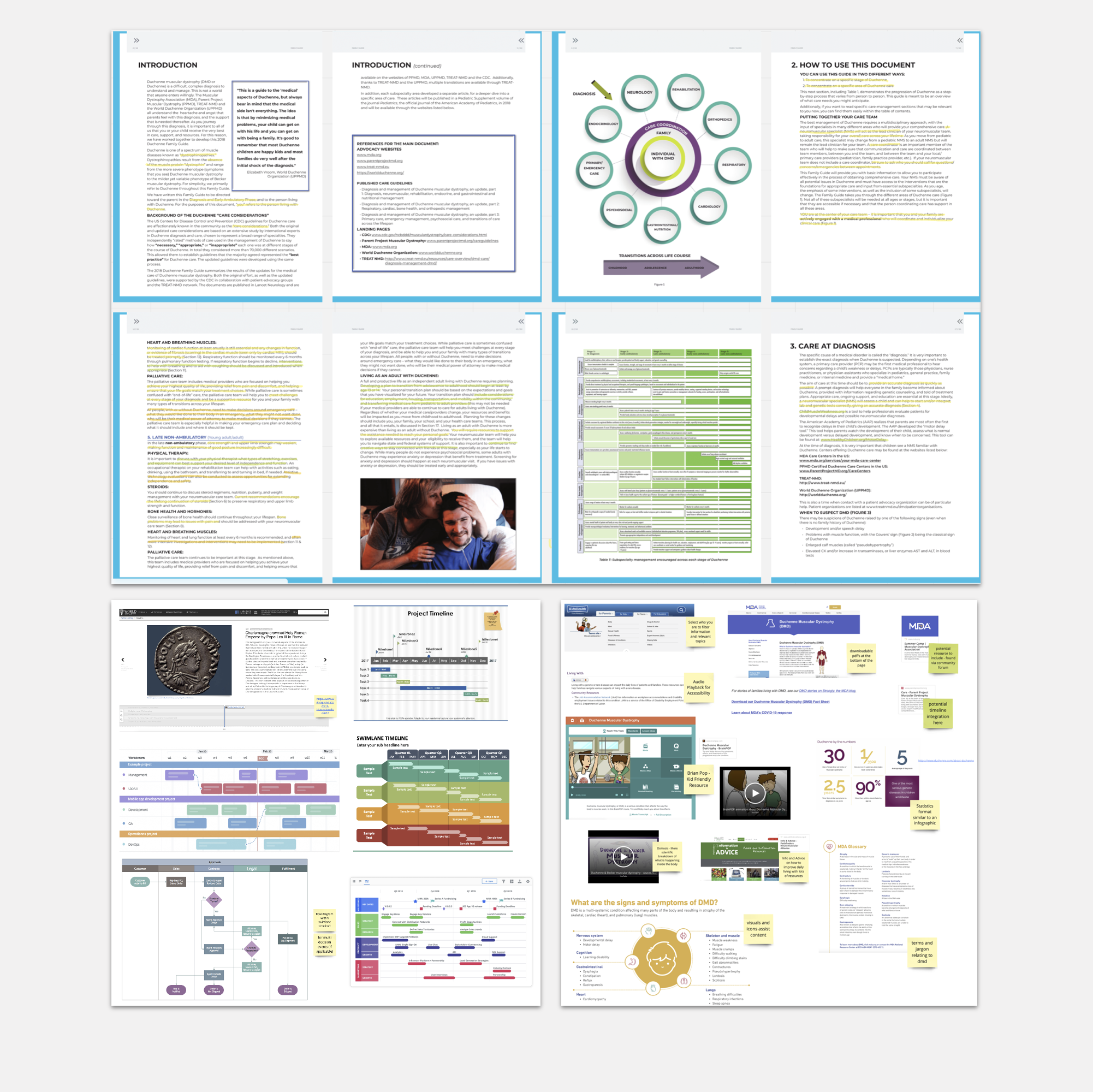
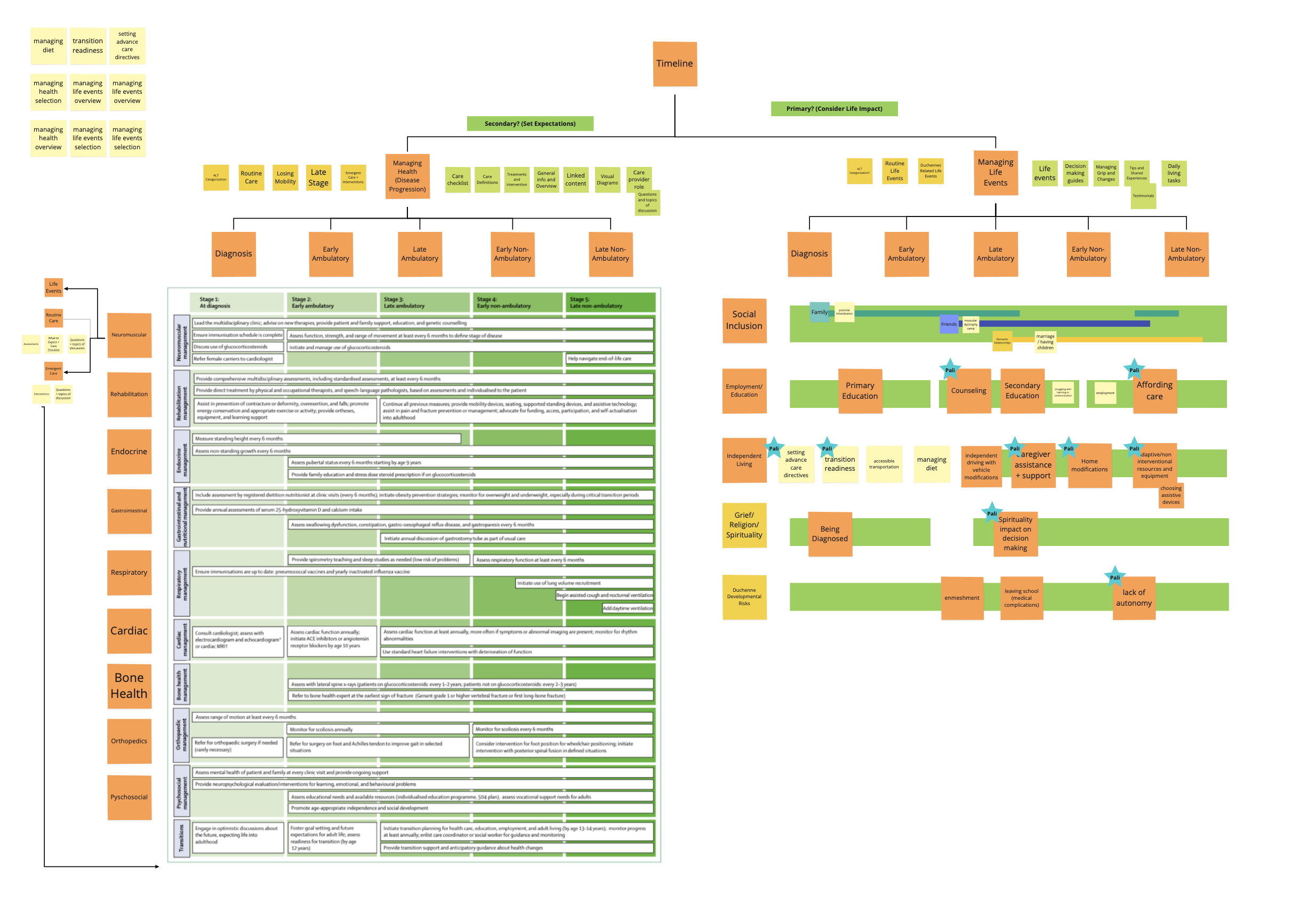
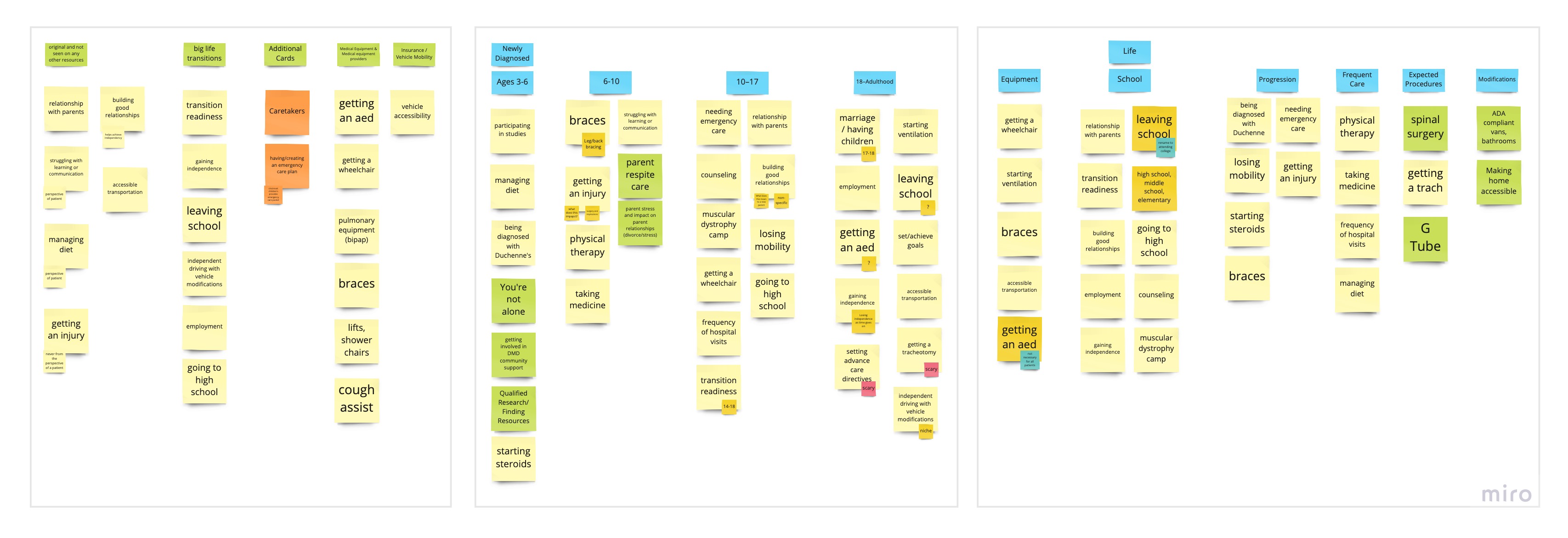
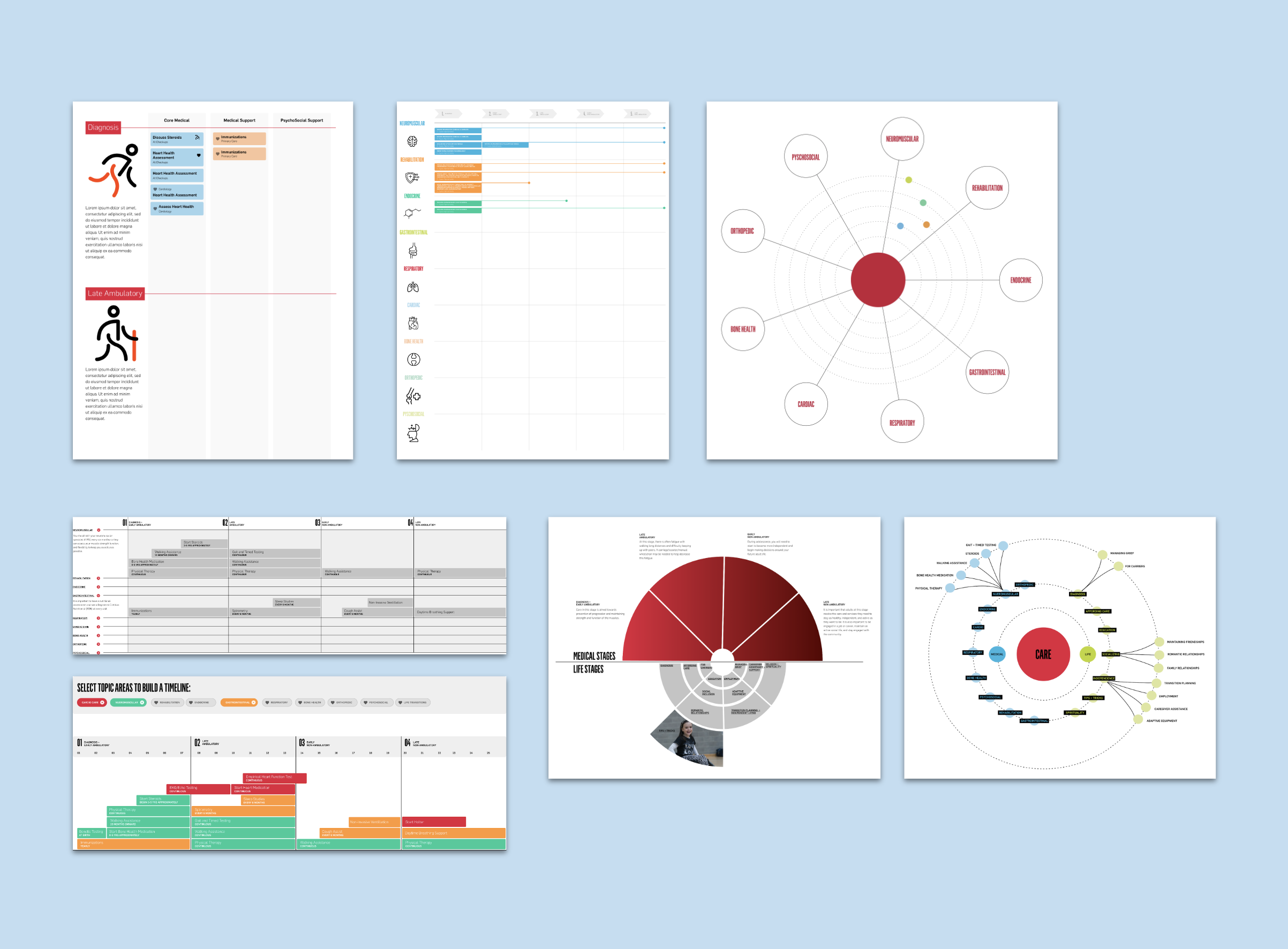
Duchenne Journey Map Tool

Interactive tool to help educate and inform patients about their care journey.

Duchenne Muscular Dystrophy (DMD) patients deserve high-quality patient and family centered physical, psychological, emotional, social, and spiritual care to improve their lives at every stage of their illness. How might we create a digital tool to help patients and families with Duchenne Muscular Dystrophy navigate their journey?

2021–2022
Completed during time at Live Well Collaborative

  • Research
  • UX/UI
  • Wireframing
  • Prototyping
  • User Testing

Background

This interactive, web-based Journey Map application will visually educate patients and families about DMD and its treatment path from childhood through adulthood.

Working with Cincinnati Children’s Division of Palliative Care we explored what a digital journey map tool could look like for patients and families with Duchenne Muscular Dystrophy. This project was a continuation from the previous semester where the team identified unmet needs and came up with the interactive journey map initial concept. Our team continued the research and worked on developing and refining the digital tool.

Project Goals

Working with team to identify what the intended goals and purpose of microsite.

Define Stakeholder Use Cases: Clinicians, parents, and patients could all be users of this interactive tool. We needed to define how each of them would use it differently, and how that could affect the UX of the site.

Define What Makes This Tool Unique: This tool is not meant to be just another website that lists information about DMD. We needed to look at existing resources and make sure that we are providing something that is filling in and existing gap and creating more value.

Keep it Simple and High Level: The goal of the tool is not to replace conversations with clinicians or give the patient and family all of the information. Rather, its intended use is to better prepare them to have future conversations and connect them to different resources about important topics.

Research

The project began with a kick-off meeting to understand scope and then doing secondary research to help define what the microsite could entail.

Secondary Research + Website Audit: By collecting copy/materials from all of our previous interviews, user testing, literature, etc. we were able to identify the biggest themes among the stakeholders involved and get the team onboarded to the project. We also reviewed existing websites to understand structure and organization of content, annotate materials on site

Card Sorting + Content Mapping Engaged with the clinician wto categorize certain Duchenne milestones and important topics to be included on the timeline tool. Then began to outline how each piece of content and information relates to one another and supports the journey, and beginning to understand any gaps of information we might have. Created interview guides for both clinicians and patients/caregives to help understand the content people would want and better understand their user needs.

Interview Guides for Patients, Caregivers and Clinicians: Created interview guides for both clinicians and patients/caregives to help understand the content people would want and better understand their user needs. These interviews included doing card sorting activities and getting initial feedback on different ways the timeline infromation would be displayed.

Research Insights

Our 3 main insights included information taxonomy and how the timeline content would be visualized, managing health/medical and life events, and focusing on palliative care to assist decision making.

Infromation Taxonomy: Exploring linear and non-linear ways of visualizing content and information. The direction chosen needs to be intuitive and make content easily understandable for new users.

Managing Health vs Life Events: Currently the existing content out there about DMD primarily focuses on health related milestones and interventions. Through out primary and secondary research, the team identified and categorized topics relating to managing life events that often aren’t mentioned in existing content. There is an opportunity space to create a tool that includes guidance on managing life events and an overview of different areas involved.

Palliative Care Focus: There is a need for palliative care to be represented in a different way. Often there are negative connotations associated with the topic and when it's brought up, and need to explore how we can make communication about the purpose better.

Ideation

Different concepts and directions were explored and then refined after receiving feedback

Sketching + Concept Brainstorming: The team benchmarked microsites and website layouts to get an idea of how components are visually layed out to help guide the team in wireframing the screens for user-testing. To kick off ideation, the team participated in a crazy 8 activity session where we quickly sketched ideas of potential layouts for specific pages that we identified within the information architecture. After the activity we each explained our ideas and marked our favorite ideas to begin wireframing.

Interviews (in addition to the stakeholder teams): Interviews included general questions to learn more about the individuals background, as well as user testing of the Fall 2020 screens, card sorting activity and ranking layouts. The initial round of interviews included 2 clinicians (Pulmonologist, Genetic Counselor), 3 parents and 2 Duchenne patients.

Key Insights: Currently the tool is very medical based and all stakeholders would like to see additional information provided.The team identified and categorized topics relating to managing life events that often aren’t mentioned in existing content.The goal of this tool should be to provide a comprehensive cverview. It should include guidance on managing life events and an overview of different care areas involved.

Refinement

After the final direction was chosen, content was collected and created as well as development off all the pages.

Wireframing + User Testing: Throughout wireframing and refinement we conducted user tests with 2 patients and families, and 6 clinicians to get feedback about information hierarchy, and different features on the site. We used this feedback to continue changing and refining the site to fit users needs and increase overall usability.

Prototyping: Two different flows and wireframe prototypes were made to compare different features and UI, and then revised based on feedback to a single direction. Clickable figma prototypes were made and set up with user interactions, touchpoints, etc. The team revised screen designs based on feedback from clinicians, parents and patients.

Key Insights: For the category overview, we received positive feedback about the 3 categories and the venn diagram representing each as a part of the journey.Users wanted a simple and linear way to navigate through the website where a lot of information from page to page wasn’t the exact same.Based on feedback we realized we needed to keep the overall information high level and relevant, and not get too detailed.

End Concept

A prototpye was created at end of summer 2021 studio project, and then I continued assistance of user testing + refinement of it throughout Fall 2021 to Summer 2022

Unfortunately, due to confidentiality I am unable to show the full final designs publicly on here. However, below are some of the unique features we included within the site called out to give a glimpse into the results of our user testing. I'd be able to provide more insights and discuss in person about specifics.

-

Summary

Team:
Bain Butcher (Faculty Advisor, UC COM & DAAP)
Babaljit Kaur (UX/UI Design Research Fellow, Project Lead)
Alexis Begnoche (Design Research Fellow)
Cindy Zhang (UX/UI Design Research Co-op)
Abbie Howell (UX/UI Design Research Co-op)


My Role & Responsibilities:
• Project management: responsible for strategy, timeline, design research process and handling communication with client
• Leading weekly calls and report out presentations
• Secondary research, benchmarking, and literature reviews to understand topic space
• Conducting interviews with clinicians, parents and patients
• Sketching, wireframing, and prototyping of screens
• Creating user testing flows and conducting user testing with stakeholders

-

Reflection

Avoid Information Overload: There is so much information out there about DMD, and often times the medicial side of things can be extremely overwhelming. Since the purpose of this tool is not to replace the exisitng conversations but rather be for people who are new to it, we needed to make sure the content was very high-level with the initial screens. Then if users wouldl like, they can explore to see more specific information.

Understanding Stakeholder Needs: The diagnosis involves many medical and social specialties being part of the journey at some point. It was very important to understand the perspective from the different clinicians, as well as patients and families who are at different points of their journey. Everyone had different things of what they'd like to see or how they would use this tool, so the team needed to prioritize the needs and identify common themes between them.

Being Flexible: As we did more interviews and user testing sessions, there were things mentioned that would be new information to us. The team learned to be quick on our feet to probe things as they came up and able to be flexible during the interview process rather than trying to follow a set in stone script.